Navigation
Install the app
How to install the app on iOS
Follow along with the video below to see how to install our site as a web app on your home screen.
Note: This feature may not be available in some browsers.
More options
You are using an out of date browser. It may not display this or other websites correctly.
You should upgrade or use an alternative browser.
You should upgrade or use an alternative browser.
Ok we're on the new refresh look and there's a lot of stuff to fix! List them!
- Thread starter revhtree
- Start date
- Tagged users None
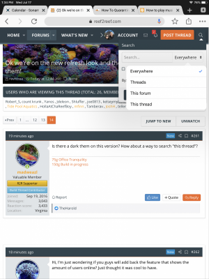
Hi, I’m just wondering if you guys will add back the feature that shows the amount of users online? Just thought it was cool to have.
Hi, I’m just wondering if you guys will add back the feature that shows the amount of users online? Just thought it was cool to have.
If you're not seeing it on the right of the page right now, try clearing cache. It's large and annoying now LOL.
OP
OP
revhtree
Owner Administrator
View Badges
Staff member
Super Moderator
Reef Squad
Partner Member 2024
Excellence Award
RGB
Photo of the Month
Article Contributor
R2R TV Featured
Hospitality Award
Article Administrator
Black Friday Sponsor
Partner Sponsor 2023
Industry Professional
My Aquarium Showcase
- Joined
- May 8, 2006
- Messages
- 47,740
- Reaction score
- 86,936
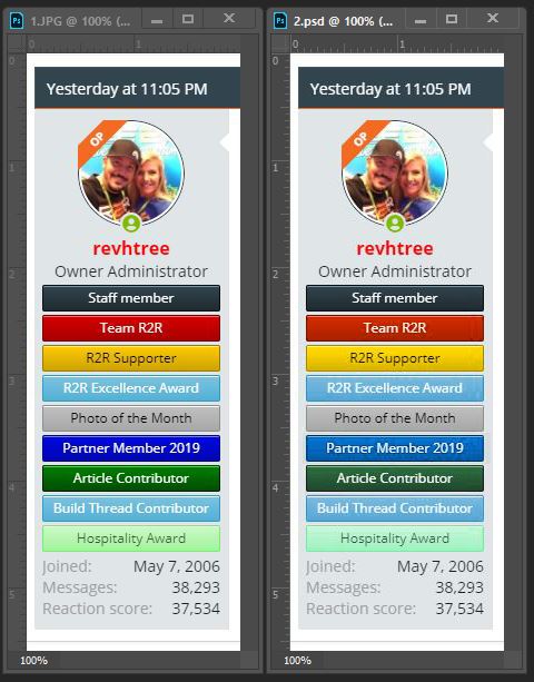
Okay this is super nitpicky, but the text on the side (much better than the icons btw) have strange colors. The yellow for example feels darker than it should and the red (Team R2R) and blue (Partner Member) are very saturated.
Basically, the color palette doesn't feel consistent. Especially compared to the over all redesign.
Bare in mind this is just a quick mock up, but I think this is a little easier on the eyes: (again, sorry to nitpick)
I agree and I will be working on making these much nicer soon!
I have went through this entire thread so far and made a list of all the complaints we're already working on the list!
Awesome to hear, I like many others am sure you will iron out the details soon enough. It's a big leap and will take time to get things to where they need to be
")
I do really like that you can now edit your posts in the same box without it opening another window, BUT you can't insert quotes anymore in edit mode it seems.
We need a glitter emoji
@Crabs McJones
Skip that, make the whole background of his header behind his badges rain glitter, all day, every day

- Joined
- Oct 3, 2015
- Messages
- 5,145
- Reaction score
- 8,758
Is there a dark them on this version? How about a way to search "this thread"?
The iPhone dark mode works well.
There is...look at the magnifying glass at the top right corner.Is there a dark them on this version? How about a way to search "this thread"?
Attachments

OP
OP
revhtree
Owner Administrator
View Badges
Staff member
Super Moderator
Reef Squad
Partner Member 2024
Excellence Award
RGB
Photo of the Month
Article Contributor
R2R TV Featured
Hospitality Award
Article Administrator
Black Friday Sponsor
Partner Sponsor 2023
Industry Professional
My Aquarium Showcase
- Joined
- May 8, 2006
- Messages
- 47,740
- Reaction score
- 86,936
test
If not already mentioned...
Go To Page '+' and '-' buttons not working in Edge, but work properly in Chrome.
Like the new look!
Go To Page '+' and '-' buttons not working in Edge, but work properly in Chrome.
Like the new look!
Can we get a way to tag posts after they've been created? It would really help when searching for something that has been covered, but no tags added at the time.
How do we access dark mode?
The new banner colors are a bit obnoxious and distracting IMO. It's hard to focus on the actual post with people like @Crabs McJones who have an insanely bright banner rainbow pulling my attention. The red is especially annoying and there seem to be a lot of red banners.
So far the site looks awesome. I was not paying g attention when I tried to log in. Looked different t and for a second I thought I had gone to the wrong site.

- Joined
- May 29, 2017
- Messages
- 2,314
- Reaction score
- 3,836
We going with Banner bages or Icon badges permanently ??? I vote banners lol!!!Icons are gone! Banners back.
Crabs McJones
I'm so shi-nay
View Badges
Excellence Award
Reef Tank 365
Article Contributor
Moderator Emeritus
Hospitality Award
Reef Tank 365 Boss
Wisco Reefers
My Tank Thread
The new banner colors are a bit obnoxious and distracting IMO. It's hard to focus on the actual post with people like @Crabs McJones who have an insanely bright banner rainbow pulling my attention. The red is especially annoying and there seem to be a lot of red banners.

Last edited:
On the app under my subscribed area for my favorite forums it doesn’t highlight (blue) for topics or forums with new or updated posts. I have to go through the regular forum to see which ones been updated which is a pain for me.

- Joined
- May 29, 2017
- Messages
- 2,314
- Reaction score
- 3,836
I think when #Crabs McJones get's 100,000 likes we should buy him a nice new Rolex Watch!!! lol
And a new Badge!!!
And a new Badge!!!
Last edited:
Similar threads
- Replies
- 0
- Views
- 101
- Replies
- 93
- Views
- 1,911
- Replies
- 29
- Views
- 376