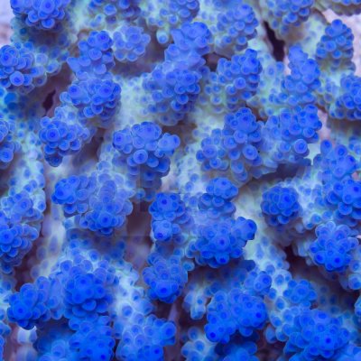
Sure this is actually pretty gimmicky, but what the heck. Here’s a delightful new acro of mine that I got chance to shoot last night. And rather than just showcase a close up or two, and do one of my near kitschy now write ups, I thought I’d share exactly how the photo was processed in Lightroom. Admittedly, I am no pro, and have only learned as I’ve gone. But with a little basic know how, and minimal knowledge of lightroom, you can produce acceptably accurate coral pics.
The pic below is the unedited RAW shot. Clearly heavy on blue and a little underexposed. There is a nice green/yellow in the body that didn't take very well, but otherwise it's a pretty good shot. Focus is Sharp and DOF is just about where I want it as well. If you are suspicious about why it's labeled as a a copy, and think that I must have done something tricky to keep the sliders at zero, please rest assured there is nothing fishy going on. It is because in order to keep the finished processed pic as is, and to get the screen shot of the fully reset version, I simply made a copy then reset it leaving the original processed as you see it at the end of this write up.
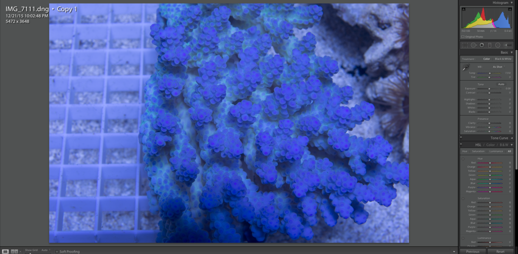
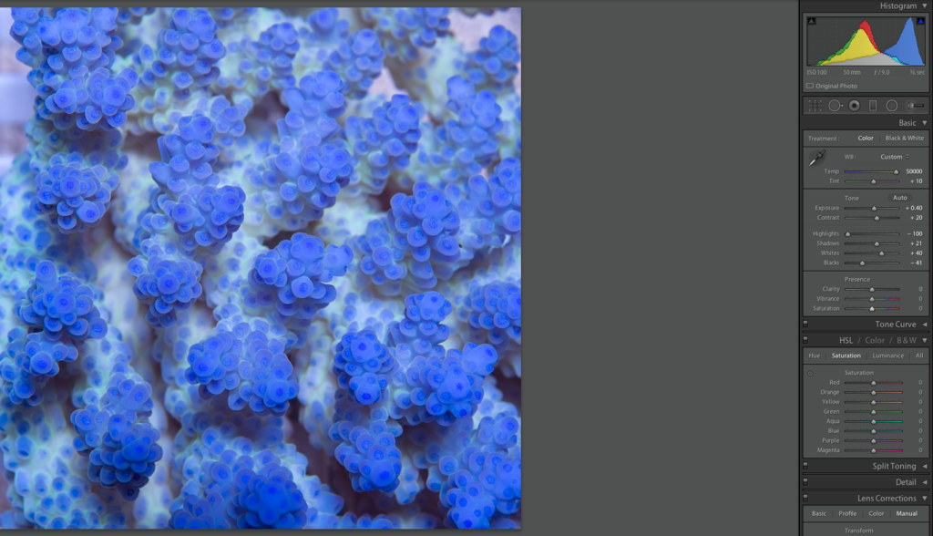
This pic was taken under one radium 250 halide, ran on an old galaxy ballast. The galaxy burns them just a few hues bluer than the spec m-80, which works pretty well for photographing. I shoot in RAW using auto WB on a Cannon 6D. The first thing I do in LR, just after applying the auto lens distortion correction, is to always pull the WB slider over to 50000. This pulls out all the blue almost perfectly. Tint will get one click to the red usually as well but not always.
Tone and exposure adjusted accordingly and cropped a little.
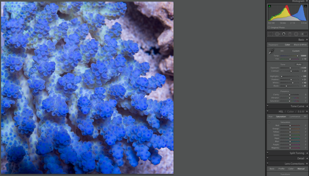
Next I’ll drop the highlights. Sometimes a lot, and sometimes a little. Just depends on the pic. Same goes for the shadows, whites and blacks.
Next is presence, which includes that infamous saturation slider. I’ve found that the better my skills have gotten at shooting coral, and optimizing my light properly, the less need I’ve had to mess with these. Saturation, more often than not stays at zero, but I’ll add a click or two a vibrance when necessary, toggling the pic between my two screens in the process, to see see how it looks on both. One monitor is calibrated pretty well and one is tweaked a bit to enhance whats on screen a little. It’s not always easy to do, but try your hardest to keep these under 10. Saturation especially. Vibrance is a much better choice to richen up a pic if it's needed in my opinion.
I don’t really use the tone curve in coral photography either. I’m usually happy enough with the adjustments I've made with the tone settings. Maybe a slight and soft “S” at most.
Then comes Hsl/Color and luminance. And pretty much the same as the presence, I’ve found that I don’t really need to mess with these much either. I will pull luminosity down a little on tips sometimes when they get wasted out. This actually works really well to restore lost tip color, and is one of my little secrets. But I’m happy to share, as the goal here is to represent the coral as faithfully as possible, and if this help you out in doing so then all the better. I can spot abuse of any of these sliders pretty easily, and the more you use LR to process your own pics, so will you.
Cropped for a close up
Ultimately that’s it. There’s a few things that happen to the raw data when the pic is actually exported to a jpeg as well, so heres a final version, with watermark. I still wasn’t completely happy with how that yellow body was washed out a bit but, I was not able to isolate it enough without making the pic look pretty bad so I settled for it.
Still a decent pic and a truer representation than most of a great looking acro!


