



- Joined
- Jul 5, 2018
- Messages
- 119
- Reaction score
- 41
- What state or country do you live in
- Canada
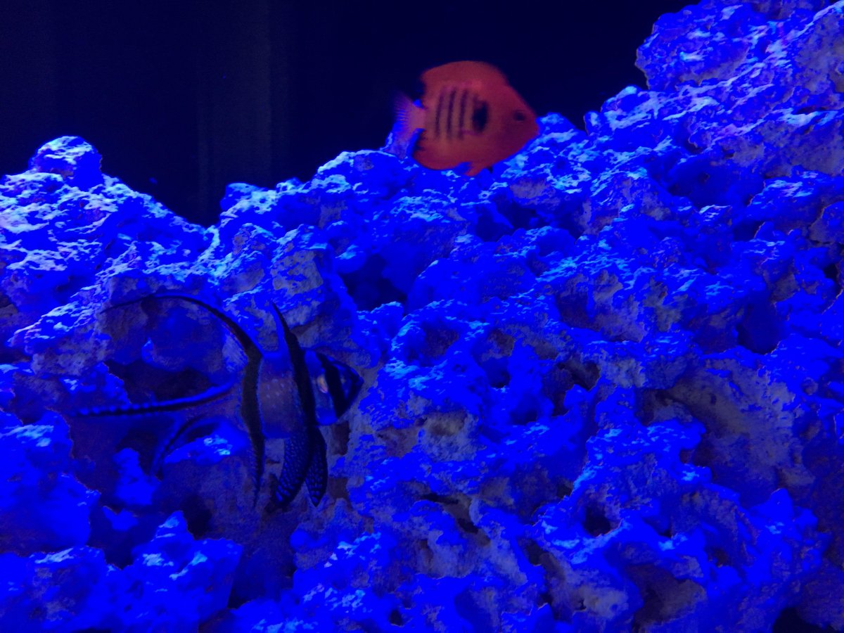
My iphone takes pictures like this, seems it cant handle the blue lighting. My tank is pretty blue, but no where near what that pictures looks like or even as blue as a AB+ set up. Any tips?
Thanks
Thanks