


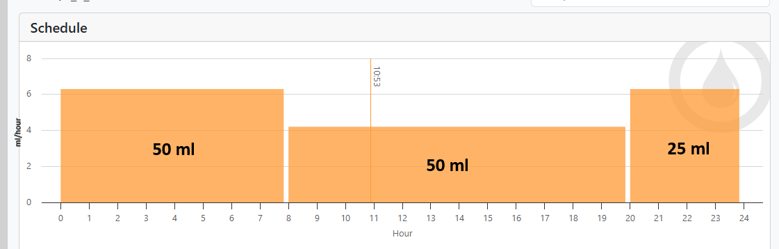
Below is a picture of the interval graph for my Alkalinity dosing:

I understand how the graph is constructed but I don't find it helpful. My intuition is that the size of the block in any interval is the amount dosed during that interval which is not the case in that graph. Also, it's hard for me to look at that graph and realize that the dosing rate is higher from hour 20 to 24 than from hour 8 to 20.
I think the following graph that showed the dosing RATE vs time would be much more helpful:
I understand how the graph is constructed but I don't find it helpful. My intuition is that the size of the block in any interval is the amount dosed during that interval which is not the case in that graph. Also, it's hard for me to look at that graph and realize that the dosing rate is higher from hour 20 to 24 than from hour 8 to 20.
I think the following graph that showed the dosing RATE vs time would be much more helpful: