


New Font for R2R

  • Thread starter Thread starter Chameleon
  • Start date Start date
  • Tagged users Tagged users None

Chameleon

Valuable Member
View Badges
Joined
Jan 5, 2012
Messages
2,249
Reaction score
93
Location
Rockville, MD
Rating - 0%
0   0   0
Hey yall,
Is the font different in this update? It feels different and a little harder to read. I'm sure I could change it somewhere but am not all that tech savy and don't know what it used to be.
 
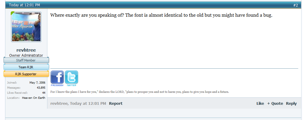
Where exactly are you speaking of? The font is almost identical to the old but you might have found a bug.
 
Has it always been times new roman?? It looks a lot like times new roman to me. In the text in the posts. Everything else looks like an arial or calibri except the text in the post like what I am typing now.
 
Maybe it is the larger margins making the times new roman look different, but it definitely looks different to me and it looks like times new roman.
 
The font type certainly looks different to me as well, but I'm not sure if it's any harder to read.
 
The font looks a little bigger and a tiny bit darker.
Much easier to read, atleast for me.
 
Yes, the font is different from the old one. Looks like it's 12pt Georgia. It looks weird cause it's a serif font. The previous one was a smaller Sans font, similar to other forum sites.
I personally prefer a Sans font for digital text.
 
Can you get me a screen shot?

P7nZvBN.png


ZvSPPY6.png
 

TOP 10 Trending Threads

ARE YOU READY TO CONFESS TO CRAZIEST, DUMBEST, FUNNIEST THING YOU’VE EVER DONE IN REEFING?

  • Yeah, I'll confess! (Share your story in the comments!)

    Votes: 43 52.4%
  • Nah, I'll keep mine a secret...(Don't be like that, share with the class!)

    Votes: 39 47.6%
Back
Top
Home
Post thread…
Market
What's new